This was my first time working with pixel art, other than the Space Invaders assets. The first challenge was what canvas size to use on photoshop. I researched online and the recommended size was 320×180 pixels. However, when trying this, it wasn’t as pixelated as I wanted for my style. I finally settled on a size of 100×56 pixels.

To start off, I chose a purple theme for a cave. I went with a light purple background and a dark purple for the foreground.
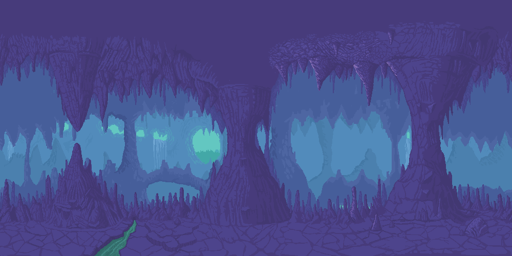
When looking at examples of caves used in video games as backgrounds, I noticed that to add depth, they have different shades of the main colour in the background.
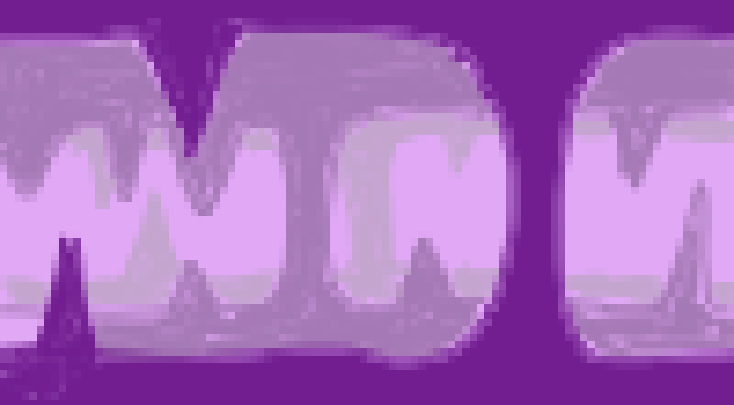
I created this effect by making the purple lighter and lighter the further away it is from the foreground. I think this effectively adds depth to my piece.

I began my character with a quick sketch to get the pose and size I desired. However, I did not take into account the little amount of pixels I had to work at, with this size of canvas, to draw details. Therefore, I ended up using the transform feature on photoshop (CTRL+T), to resize my character appropriately.
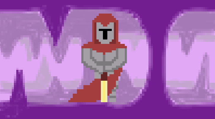
Once resized, I added details such as the cape and the sword. I wanted the colours to work well together, and so I chose red and gold for the sword. These colours don’t blend with the purple and make the piece boring, but also don’t clash with the purple and make it unattractive – the red provides a nice contrast.
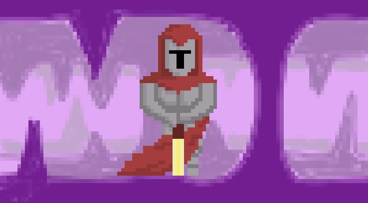
To give the character more depth, I added shading. I imagined the light coming from the right. The most successful bit of shading here is on the cape, as it adds details such as wrinkles and creases – making it look like the cape is actually blowing.
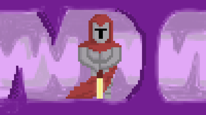
A new technique I learnt whilst researching pixel art was dithering. Dithering is used to create colour depth within pixel art and it leads to a more 3D look. I attempted dithering on the foreground rocks in my piece. It was a challenge to try the dithering technique here as the rocks were so small and there was not much room to work with.
If I were to improve my piece, I would use one coherent shading style. For example, just using dithering for shading and depth in this piece would give it a really nice look and effect.
REFERENCES :
Saultoons (2021) The Ultimate Pixel Art Tutorial [Video]. Available online : https://www.youtube.com/watch?v=lfR7Qj04-UA [Accessed 04/12/2021].