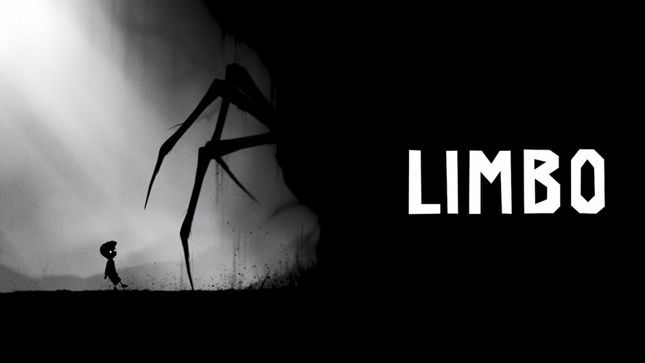
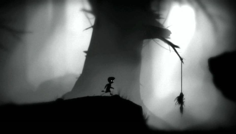
For my environment analysis I chose LIMBO. I chose this game’s environment as it is very unique and consists of no colour. One may think that this would inhibit LIMBO’s ability to convey a great environment, however it is quite the opposite.

The dark and simplistic environment of Limbo creates an unnerving amount of fear for the player. Whilst being a bold choice, the developers’ decision to make the entire environment just black and white creates a sense of unease. They play with the idea of humans’ being scared of the unknown by hiding terrifying monsters in the dark environment, perhaps most famously being the spiders’ legs.
It could be argued that the use of depth in the background within the environment creates a false sense of security. Not only does it give the environment more life, but it is used as a clever tool to draw the player into the world of Limbo. The contrast between the pitch black foreground and the lighter complexion of the background could trick the player into thinking there is a way out of this nightmarish situation. This, in turn, plays into the sense of confusion the player has. They, in fact, are the ones stuck in Limbo – never knowing if they will reach that bright light.
