Research (11th – 17th March):
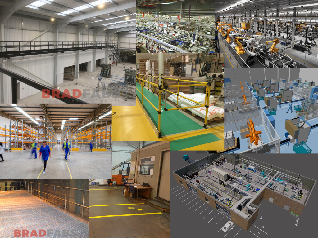
To inspire the layout of my factory level, I researched a variety of interiors. The aim of this research was to discover what rooms and equipment is consistently included in most factories, in order to accurately depict an abandoned version for my level.
Layout Sketches (11th – 17th March):
Bullet Pointing Key Events:
A common practice amongst level designers is to imagine and write down key points that will occur within the level, before thinking about the actual layout or how the level will look (Steve Lee, 2022).
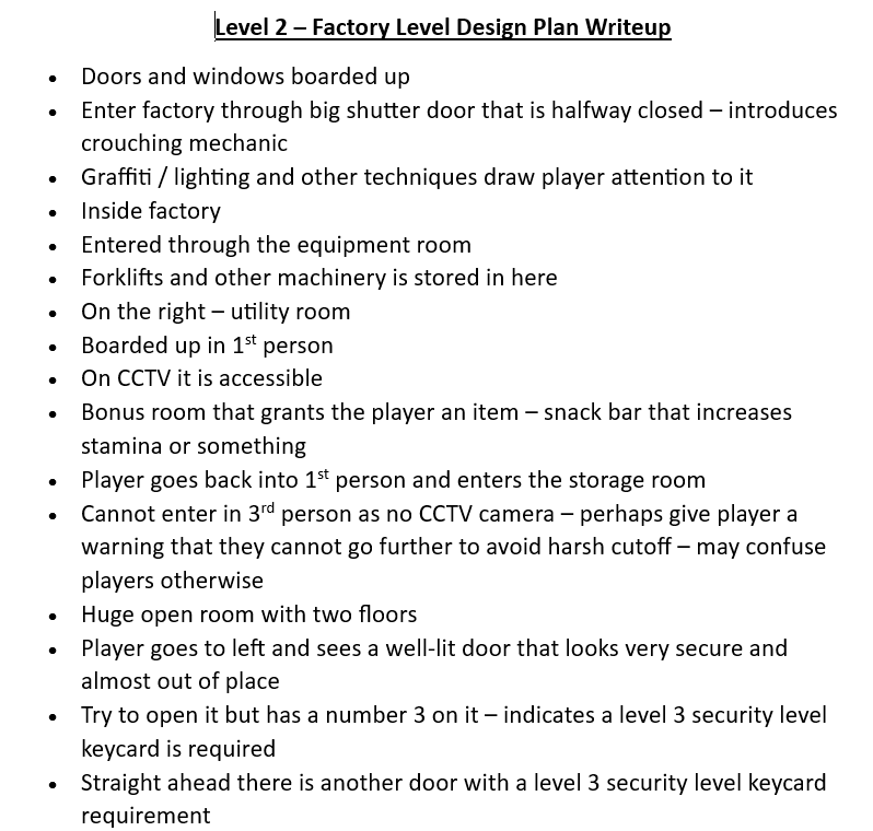
Whilst these bullet points are rather brief, they aided in designing the final layout by giving me a platform to build upon.
Quick Sketches:
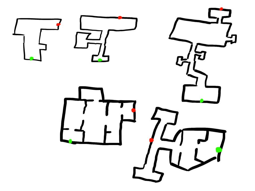
Before jumping straight into detailed layouts, I instead opted to created some quick thumbnail sketches – a similar method to my character design process.
These layout sketches helped me swiftly generate ideas that could then be merged together in more detailed layouts.
By using the bullet points of the level that I created beforehand, I was able to imagine what each layout could look like in relation to certain puzzles and events. This led to more cohesive and focused designs, instead of just random shapes with no thought behind them.
On the other hand, imagining the level beforehand may have led to less creativity and range in the designs of the factory, due to having a preconception of what the level should be.
Final Layout (11th – 17th March):
Gates & Valves:
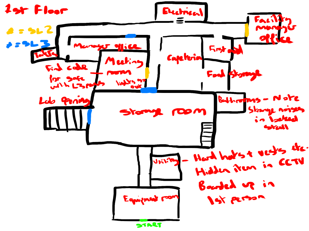
In level design, gates stop the player’s progress until a certain condition is met (Shaver, 2018). In my level there is a keycard system, which will lock certain doors (gates) for the player until they acquire the required level of keycard.
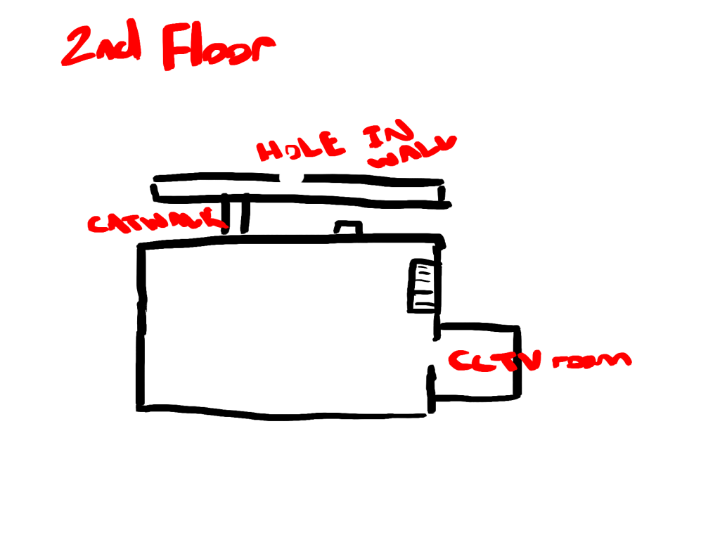
Valves are the opposite, as they let the player progress but shut off previous sections – preventing backtracking (Shaver, 2018). A valve example in my level is when the player will be locked from progressing through the factory’s ground floor via a level 3 keycard door, and so they will have to venture upstairs. On the upper floor, they will find a catwalk that leads to a hole right above the locked door. When they player drops down, they will now be trapped in the new section of the factory until they access the level 3 keycard.
The use of both of these techniques together will prevent aimless wandering and break up a large level into manageable chunks for the player.
CCTV Mechanic Puzzles:
The unique mechanic of our game is the CCTV third-person view. Therefore, I wanted to include as many puzzles relating to this mechanic as possible, keeping the player engaged by using it in different ways.
At one stage in the level, the power will turn off – locking all doors and turning off all lights. Alongside this being a small mid-level scare for the player, it offers an opportunity to make use of the security camera mechanic. The player will have to access the sheriff through the CCTV footage and navigate their way to a room where the power generator is stored. After completing a wire puzzle, similar to the one in Among Us (2018, Innersloth), the power will turn back on for the detective.
This, alongside a few other CCTV puzzles, should keep the player engaged throughout the level. However, since our game is in the horror genre, playtesting will be required to perfect the difficulty of the puzzles. Too hard, and the pace will be slowed down to a point of ruining the horror tension, whilst puzzles that are too easy will make the player feel like there is no challenge – potentially leading to boredom (The Anatomy of Fear, 2020).
Blockout (18th – 31st March):
Initial Blockout:
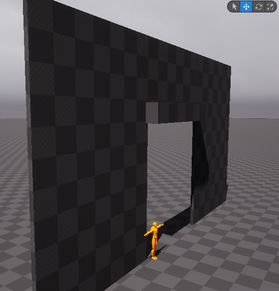
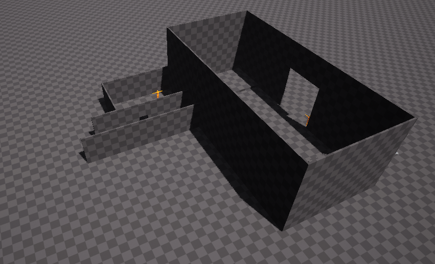
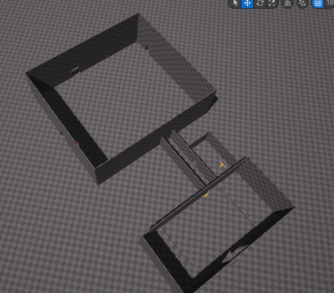
I quickly blocked out the beginning section of the level, using the yellow mannequins to guide my scale.
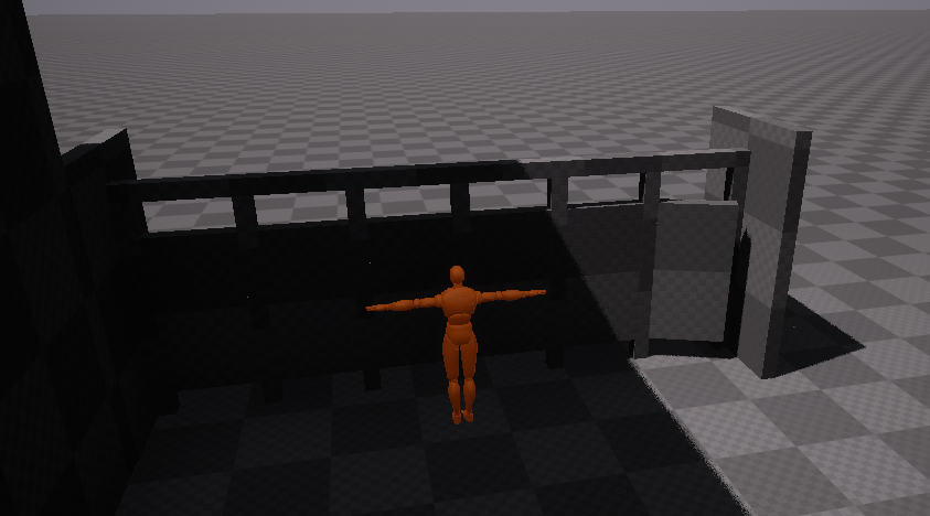
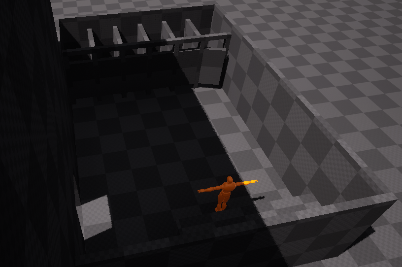
Since the factory itself is so large in scale, the mannequins weren’t useful when gauging the height of the ceiling and the second floor. However for smaller rooms and objects, such as the bathroom and doors/stalls, they were helpful as a human scale guide.
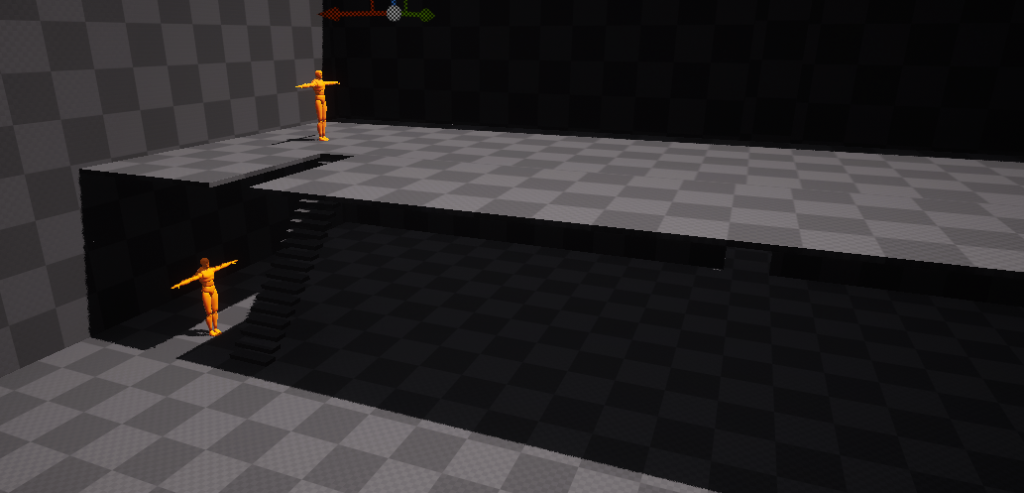
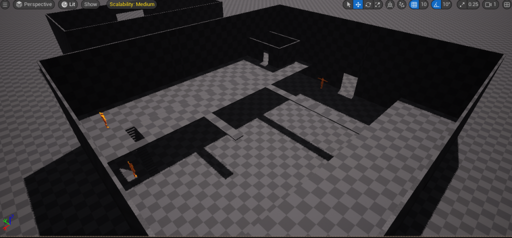
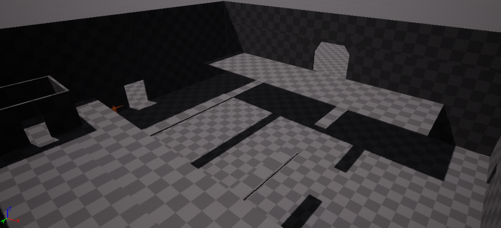
Verticality within a level can embody the player’s progression whilst orienting them towards their goal (TheLevelDesignBook, 2022). The variation in height also aids in keeping the player engaged with the level, even if it occurs subconsciously.
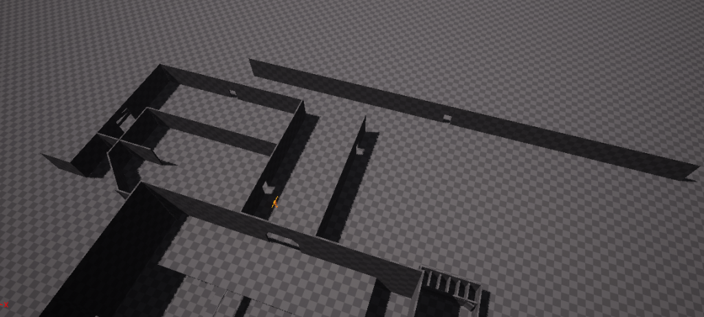
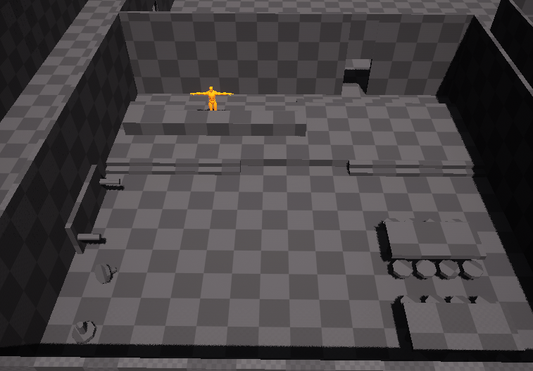
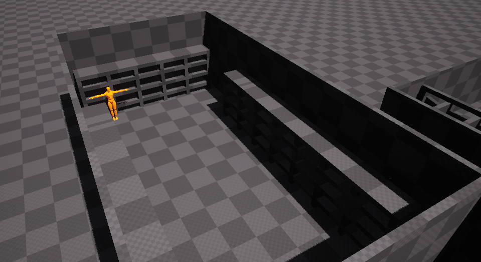
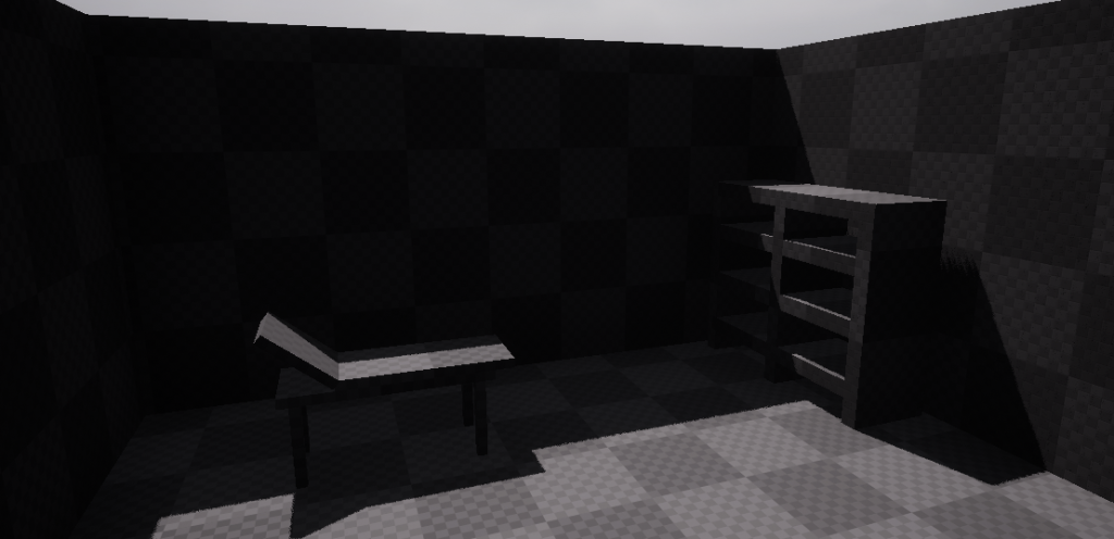
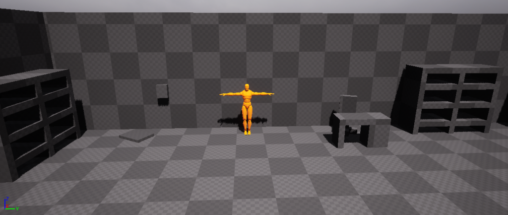
After both levels of the large storage room were blocked out, I focused on creating the smaller rooms such as the cafeteria and facility manager’s office.
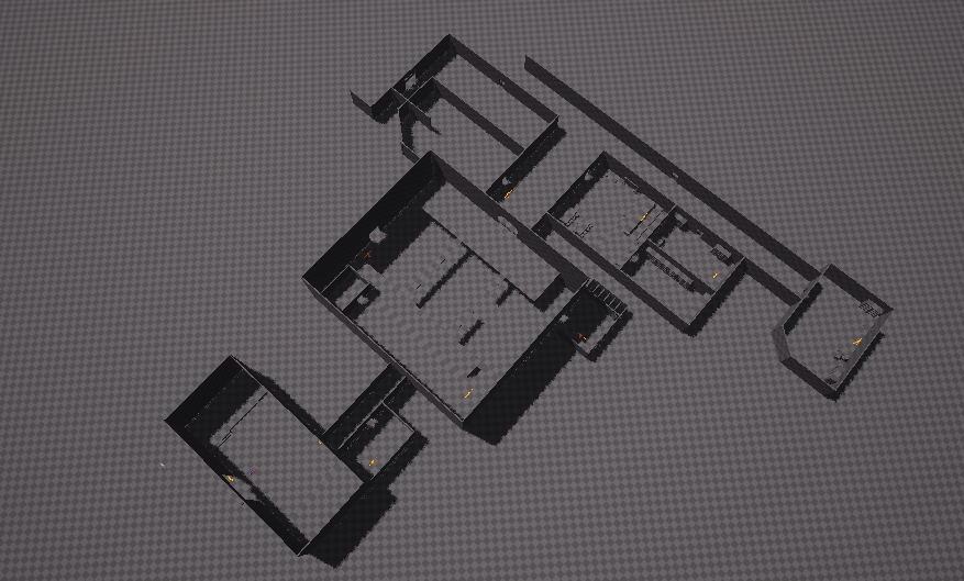
Most of the level was blocked out at this stage, and so I gave the level to my parents to playtest. They knew where to go throughout the majority of the level, however they did struggle in realising they had to go upstairs to progress past the storage room.
To aid in guiding the player up the stairs I will add coloured guard rails as well as utilising level design techniques such as leading lines.
Underground:
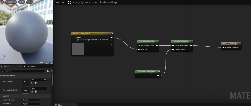
To add an underground section to the level, I needed to create a special landscape material that had an opacity mask (3Dynamics, 2024).
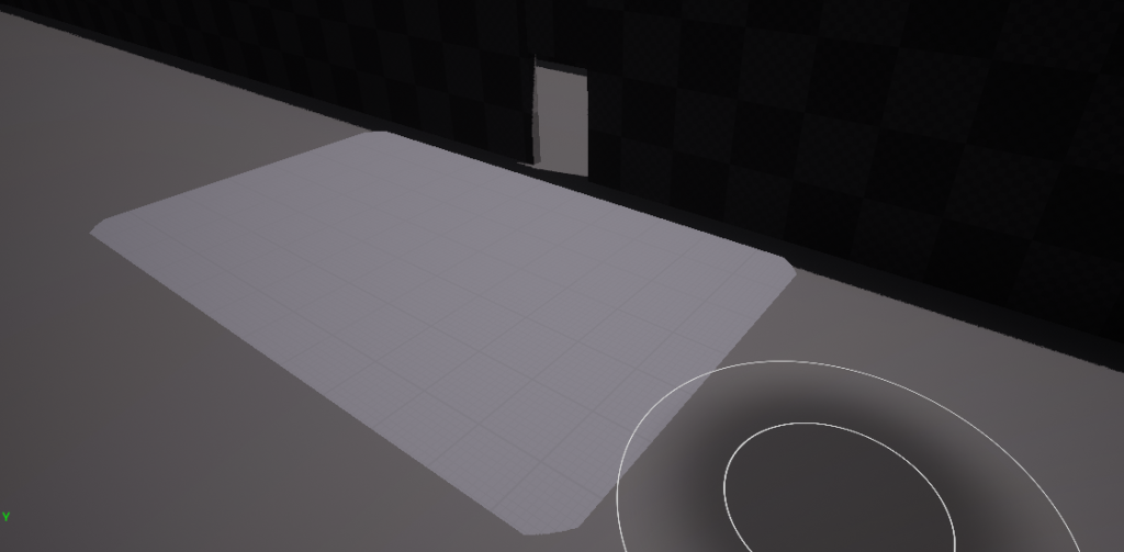
This material allowed me to erase a small section of the landscape, as the standard delete brush Unreal provides creates comically large holes with no ability to adjust the size.
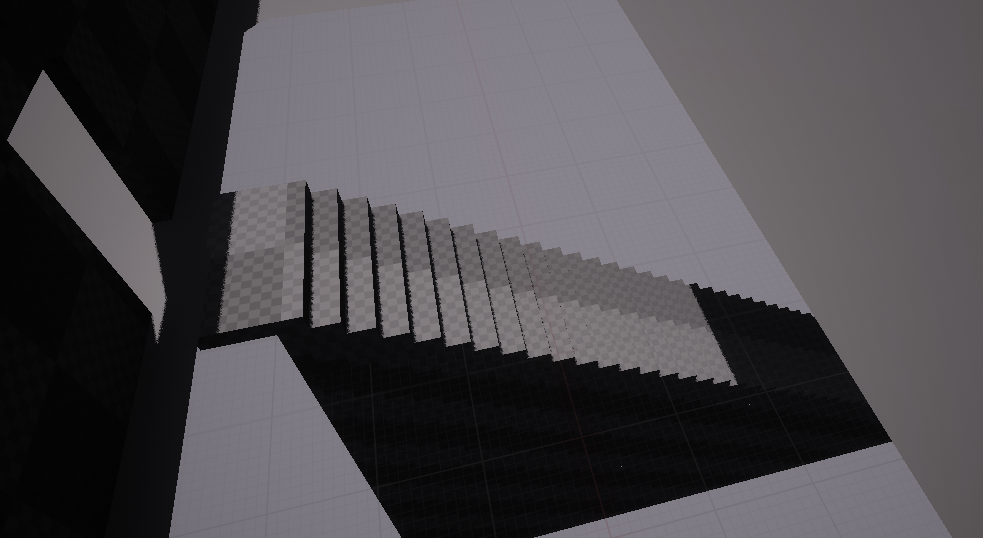
From here, adding stairs and a plane below the landscape to create the underground section was easily achievable.
Adding Colour:
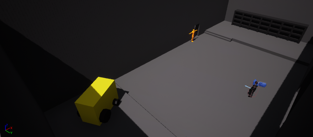
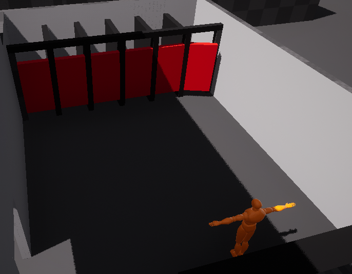
Similarly to the first level, I added colour to my blockout to help communicate my ideas to my team.
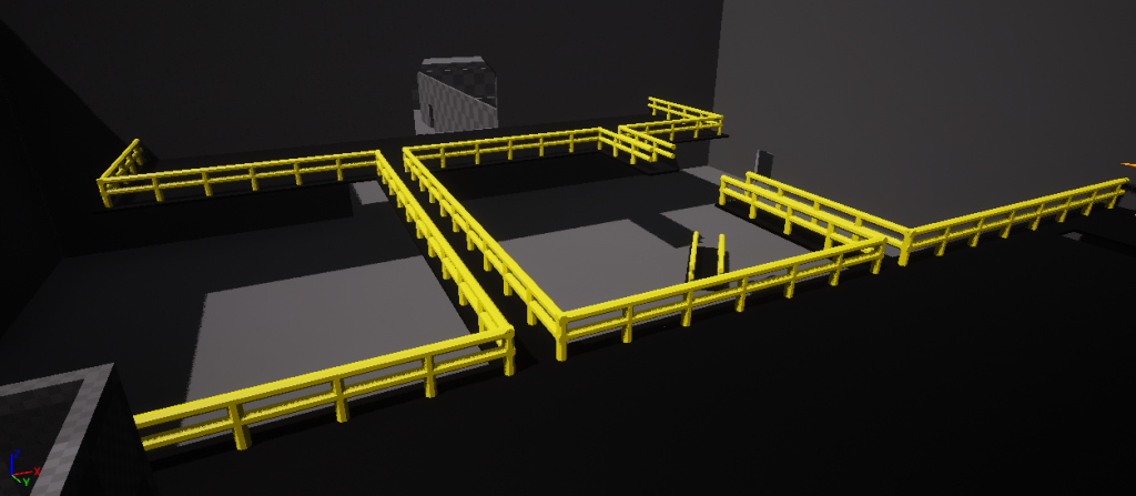
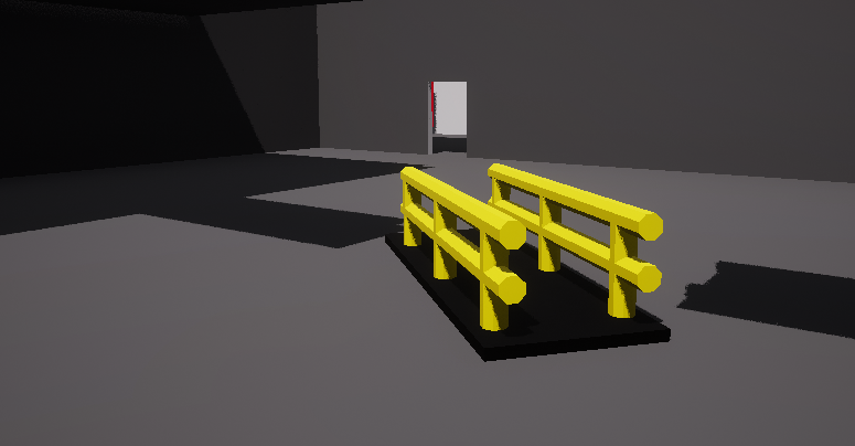
I decided to add bright yellow guard railings around the top floor for two reasons. The first being that during my research of factories, guard railings were a common occurrence for safety reasons. The second, and most important, is that the bright colour will attract the player’s attention and lead them to the correct path, without being out of place in the level.
One of the two walkways has broken and fallen to the floor. This gave me an opportunity to use the broken piece as a subtle way to further guide the player, through the aforementioned leading lines technique.
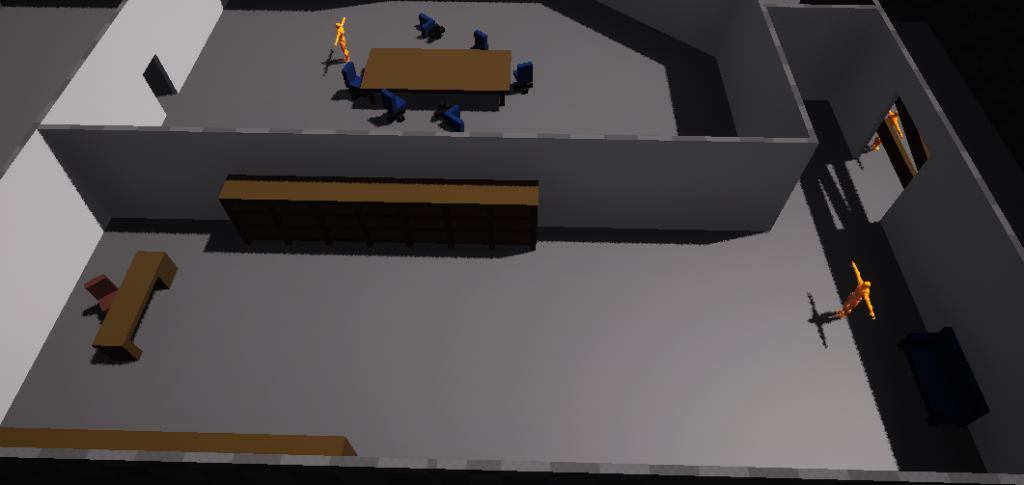
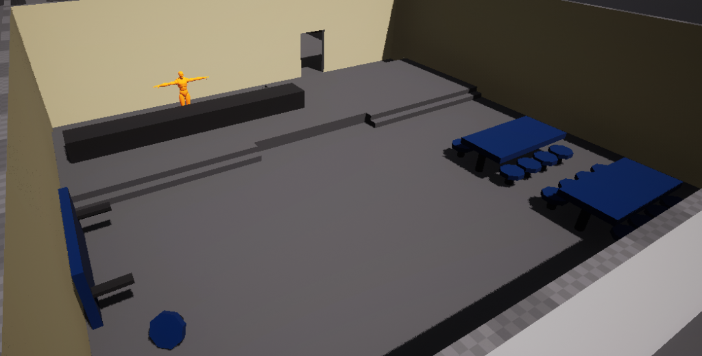
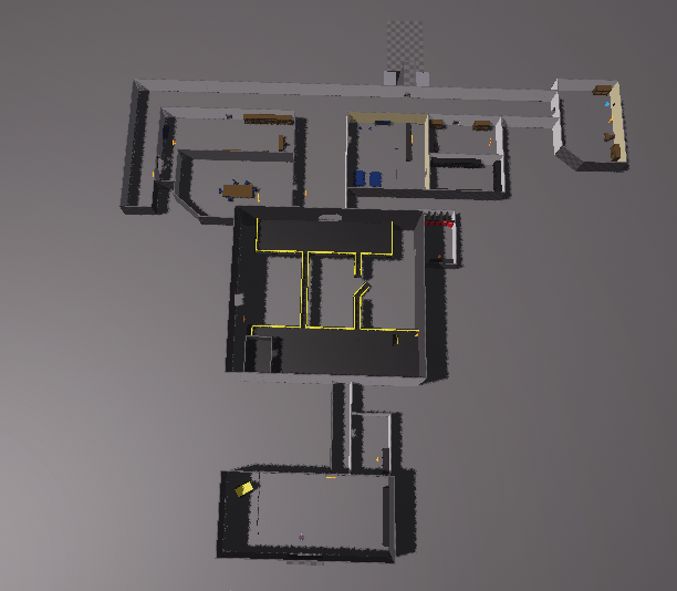
Overall, adding colour to the blockout makes it easier for my team to know which finalised textures should be placed on certain objects. Furthermore, it allows me to conduct further playtests that are more accurate to the final level’s appearance.
Lighting:
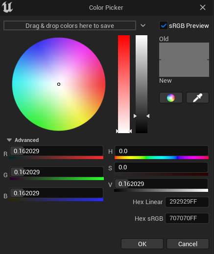
Before creating any lights, I adjusted the skylight in the level to be darker, which in turn made the level feel much more like a horror game.
Humans have a natural fear of darkness due to the increased likelihood of our ancestors being attacked when they were unable to see at night (Emanuel, 2017). Therefore, most horror games are set in dark areas – ours being no exception.
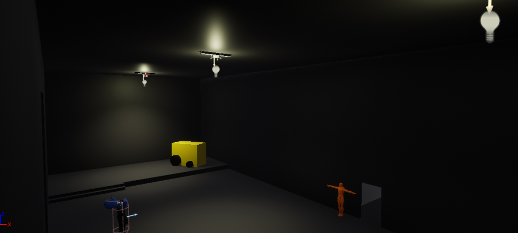
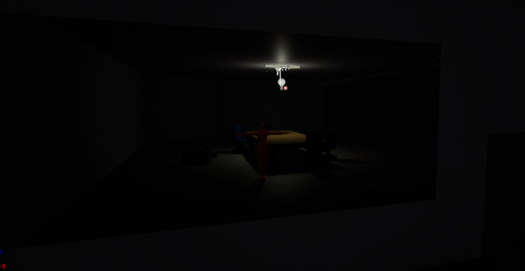
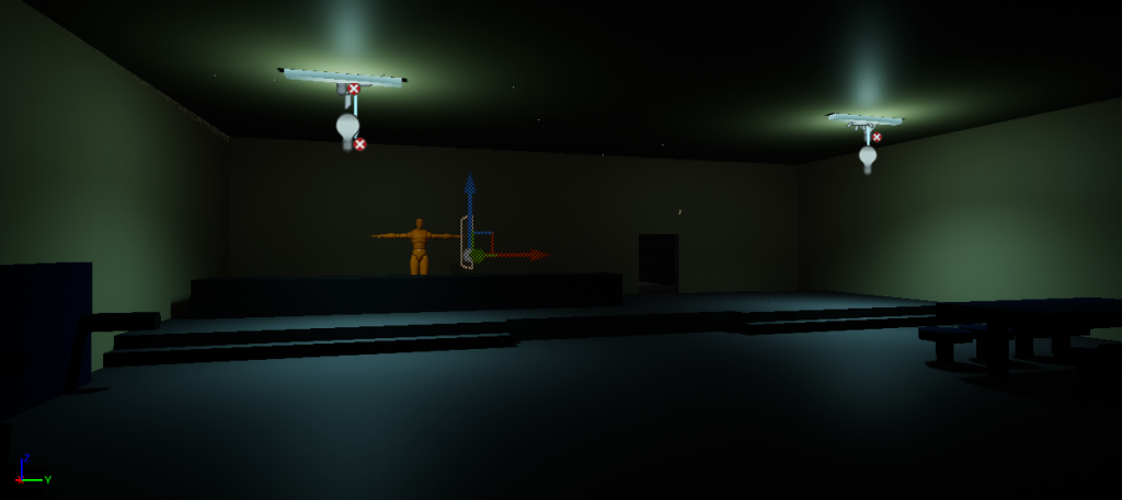
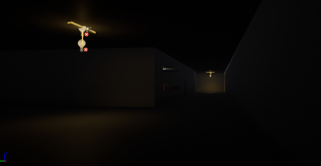
I decided to have different coloured lights in certain areas of the level to evoke various emotions from the player, whilst also adding extra visual interest to the level.
Although colours don’t have concrete interpretations, people do share common feelings towards them (Illuminated Integration, 2021). For example, orange is often associated with being warm and safe, therefore I used it in the darkness of the hallways to create a false sense of security for the player. It could also be seen as giving the player a little bit of hope in an otherwise pitch black setting, acting as a guide to follow towards the end of the level.
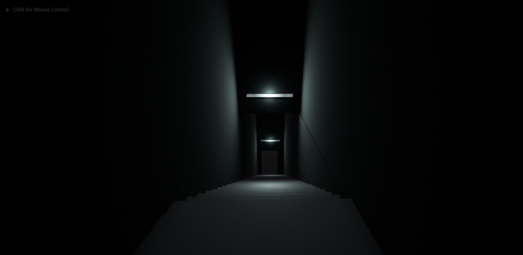
Players are naturally drawn towards light sources and so they can also be used to lead the player down the correct path (Shaver, 2018). Without the lighting on this staircase, the player may not be as tempted to go downwards.
Conclusion:
Whilst blocking out the second level took a sizeable chunk of the overall development time, it was also the largest and most ambitious level in the game. In a larger team, other members would have handled lighting and coding mechanics, however I felt most comfortable completing level two by myself. Not only did I want to showcase these skills in my portfolio, but in terms of development it would be a lot slower to keep handing the project back to each other after completing one section of the level.
Furthermore, completing this level by myself gave my teammates the opportunity to work on their own jobs – such as sound and 3D modelling. That being said, if I had the chance to redo this project, I would suggest splitting the workload of this level across the entire team due to the inability to work on other tasks for the project during the entirety of March.
Now that the factory had been blocked out, I handed the project back to Lennox so he could implement my animated 3D models, as well as a couple new mechanics such as crouching and a flashlight.
References:
- 3Dynamics (2024) Landscape #2 – How to Make Holes in a Landscape (with collisions) – Unreal Engine 5 [Video]. Available online: https://www.youtube.com/watch?v=IZDbcZlxtu4 [Accessed 25/03/2024].
- Emanuel, D. (2017) The psychology of black and why we’re scared of the dark. CNN, Internet edition. 1 September. Available online: https://edition.cnn.com/2017/09/01/health/colorscope-black-fear-of-darkness/index.html [Accessed 25/04/2024].
- Illuminated Integration (2021) The Importance Of Colour In Lighting [blog post]. Illuminated Integration, Internet edition. Available online: https://illuminated-integration.com/blog/importance-of-color-in-lighting/#:~:text=Color%20temperature%20is%20the%20description,correlated%20color%20temperature%20(CCT) [Accessed 25/04/2024].
- Innersloth (2018) Among Us [Video game]. Available online: https://store.steampowered.com/app/945360/Among_Us/ [Accessed 13/03/2024].
- Shaver, D. (2018) Invisible Intuition : Blockmesh and Lighting Tips to Guide Players. Available online: http://davidshaver.net/DShaver_Invisible_Intuition_DirectorsCut.pdf [Accessed 17/03/2024].
- Steve Lee (Level and Game Design) (2022) How I design levels in text first, and why (HL2 level Part 1) [Video]. Available online: https://www.youtube.com/watch?v=0FSssDWEFLc&t=34s [Accessed 11/03/2023].
- The Anatomy of Fear (2020) STOP Doing This!!! – The 7 Horror Game Developing Sins [Video]. Available online: https://www.youtube.com/watch?v=Cud8INaOrWY&t=1s [Accessed 09/03/2024].
- TheLevelDesignBook (2022) Verticality [Blog post]. TheLevelDesignBook. Available online: Available online: https://book.leveldesignbook.com/process/layout/flow/verticality [Accessed 25/04/2024].