After I made some quick sketches, I went through some of the ideas I liked and expanded upon them a little bit further.
Finalised Idea 01:
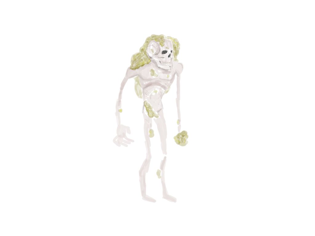
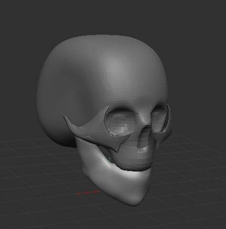
I chose to stick with the infected theme for this one, however instead of arms being used for echo location, the skull chomps down to create sound waves , with the infection itself being able to detect its prey.
I like this design as the viewer can clearly tell that the monster cannot see as it has a lifeless skull for a head – therefore echolocation makes sense for the character. The obscure proportions also gives the design an eeriness.
For the colour, I decided to make the infection green, as it can be associated with disgust and can gross people out. The body is just a skin tone with a slightly grey tint just to emphasise that this body is dead.
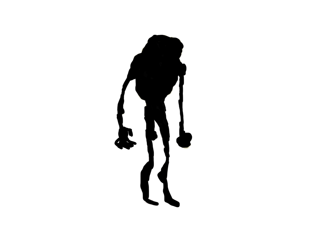
A negative about this design is that the silhouette doesn’t have anything distinctive about it – it’s not instantly recognisable.
Mary Jane Begin in her course “Learning Character Development and Design” states that “the first thing that people tend to see and read is the overall shape of the character’s form and silhouette” and goes on to say that “the silhouette and the shape of a character needs to stand out from the rest”.
This character doesn’t have a distinctive feature that sticks out instantly to the viewer, therefore, that will be something I will focus on in my next design.
Finalised Idea 02:

For the second finalised concept, I wanted to go back to the arms idea I discussed previously. This time, to give a reason as to why echolocation is used by this character, I made the infection spread around his face as well – covering his eyes.
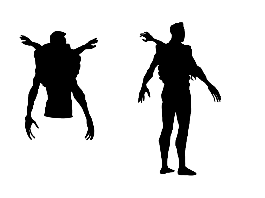
The silhouette for this design is extremely recognisable due to the arms sticking out from the back. Not only is it recognisable from the front, but also from all angles – as shown on the right. This is because the arms on the back are placed in such a manner that they will be visible from every angle – creating an interesting and unique silhouette.
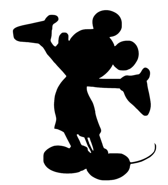
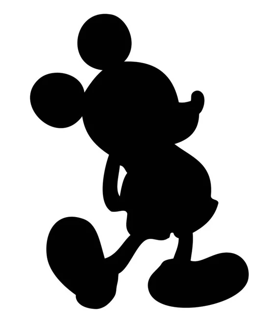
A good example of this would be Mickey Mouse, who is recognisable no matter the angle he is at or pose he is in due to his two massive ears that create a unique silhouette. The arms on this design are similar to Mickey’s ears in this sense.
I liked this design so much that I even went as far to start blocking it out. However, midway through the blockout process I began to have second thoughts. Whilst the silhouette was interesting the character felt less interesting to me when in 3D for some reason. I think the proportions were too human-like to be interesting to me and not exaggerated enough to feel like a scary monster.
Finalised Idea 03:
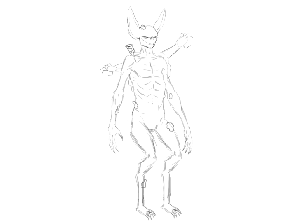
I began this concept with a sketch, just like the previous two. However, this time I made sure to really exaggerate the proportions and add features that would make for a unique looking monster.
I decided to give this character massively exaggerated ears for a couple reasons. The first being that this character is based off of a bat and so it makes sense for its echolocation. The second, and perhaps more important, reason is that it helps make the character more identifiable to the viewer by creating a more intriguing silhouette.
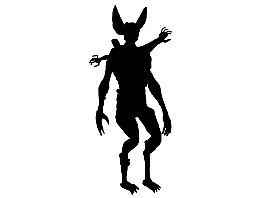
The exaggerated ears make this silhouette and character much more recognisable than my previous designs.
Shape Language:
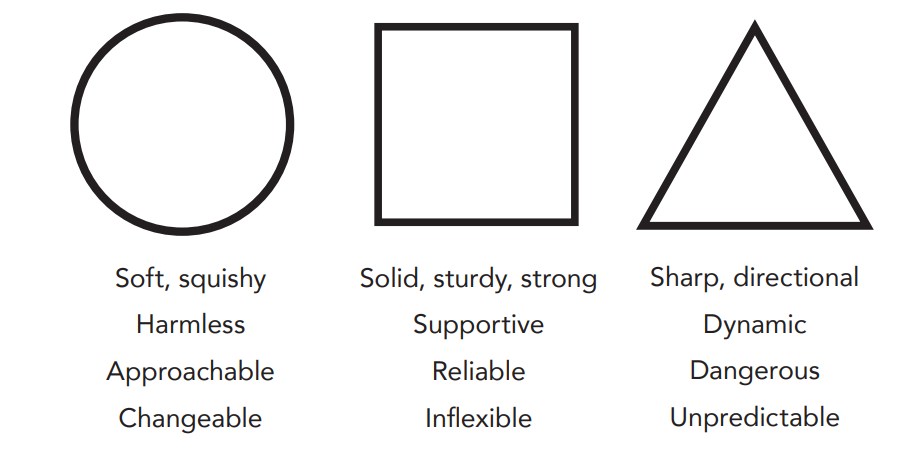
Certain shapes, when used in character design, can subconsciously communicate the character’s story and personality with the viewer without the need of any further context. This is known as shape language.

For my character’s design, I tried to include as many triangles as possible when designing him as my character is meant to be an evil monster. Triangles represent danger and a sense of unpredictability due to their sharp edges – therefore they make sense to be part of this design.
For the head, I thought a circular shape would be a nice contrast to the triangular ears as circles represent trust and harmlessness. For this character, the circle represents the fact that he was not always a monster and still has that slight bit of humanity left inside (expanded on further in the character backstory section later), whilst still striking fear into the viewer with the triangular aspects of the design.
Finally, the square shaped body is meant to give a sense of strength, mainly to compensate for my character being really skinny. It makes the character feel sturdy and unstoppable, potentially adding to the fear aspect.
Colour Experimentation:

For the first colour combination I chose a base colour of brown for the monsters skin. I chose this as the character is inspired by a bat and so I colour picked an image of a bat in Photoshop for the base.
I decided to colour the eyes red to make them really pop when the viewer looks at the monster. Red is often associated with danger, and since the eyes are the first thing most people look at, I wanted to get that sense of danger across straight away.
For the infection, I wanted the colour to be a contrast of the red eyes. And so, I chose the colour that is opposite to red – green. This also works well as green is often associated with illness and infection anyway.
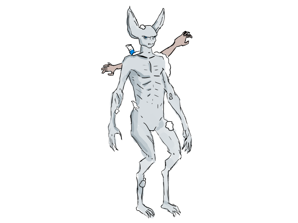
For my second colour experiment I went for a much cooler pallet. I decided on a cool grey/blue undertone and stuck with the blue theme for the eyes. Whilst this colour pallet is overall cohesive, I feel as if it doesn’t fit the character and isn’t bat-like enough in its pallet.
Overall, the first option fits the bat theme much better and the red eyes give a bigger sense of danger – unlike the blue ones.
Character Backstory:
Thousands of years in the future, on a ship deep within the dark depths of space, a deadly creature crawls amongst the survivors. But how did this creature come to be? In the year 3026, a huge explosion destroyed Earth. The explosion however, was known about by government officials – one of them being Doctor John Smith. Smith was part of a secret escape plan to leave Earth before the explosion occurred. However, whilst the plan worked and him and a few others managed to escape, the explosion was so bright that it blinded him instantly. In an attempt to regain his eye sight or any kind of sight at all, he began to experiment upon himself. He injected himself with bat DNA, but something went wrong. The bat was infected. The toxin ran through his bloodstream and before he could realise, it was too late. He gained his sight back, but at what cost?
Conclusion:
Overall, my third finalised idea was the design I went with as the silhouette felt more unique than my previous designs, whilst the shape language made sense for the character. The colour scheme may change when I get around to colouring my character, however the first pallet I came up with fits the character good enough for now.
References:
Begin, M.J. (2016) Learning Character Development And Design. Available online: https://www.linkedin.com/learning/learning-character-development-and-design?trk=course_title&upsellOrderOrigin=default_guest_learning [Accessed 09/01/2023].
Walt Disney Museum (2020) Tips & Techniques Shape Language. Available online: https://www.waltdisney.org/sites/default/files/2020-04/T%26T_ShapeLang_v9.pdf [Accessed 09/01/2023].