Research (30th October – 5th November):
Detective:
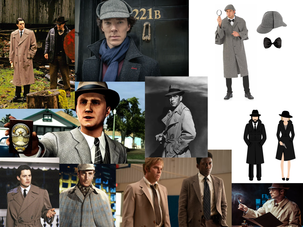
Although the year is 2012 whilst playing as the detective in the game, I still found it useful to look at much older detective designs for characters, such as Sherlock Holmes, as they helped shape the stereotypical detective look.
From my research, I was leaning towards the character wearing a trench coat, as that seemed to be a more modern take on a detective. My team agreed to a description of “young and cocky” for the personality of the detective, and so a trench coat would fit better than the old-fashioned stereotypical detective clothes.
Sheriff:
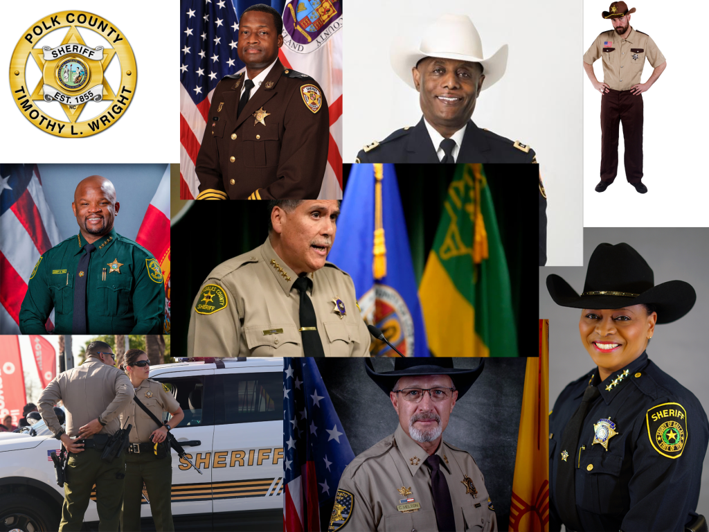
Whilst not all sheriffs wear hats, I found it to be a defining feature in easily identifying them from normal law enforcement.
The game is set in Texas, where sheriffs are fully empowered peace officers with county-wide jurisdiction. The bottom right image is a current sheriff of Texas and so the uniform will be based closely on hers.
What Makes Good Concept Art:
Concept art is about ideas and solving problems for 3D modellers and game designers (Dealessandri, 2021). The art doesn’t have to look the nicest, but it must be clear and easy to interpret.
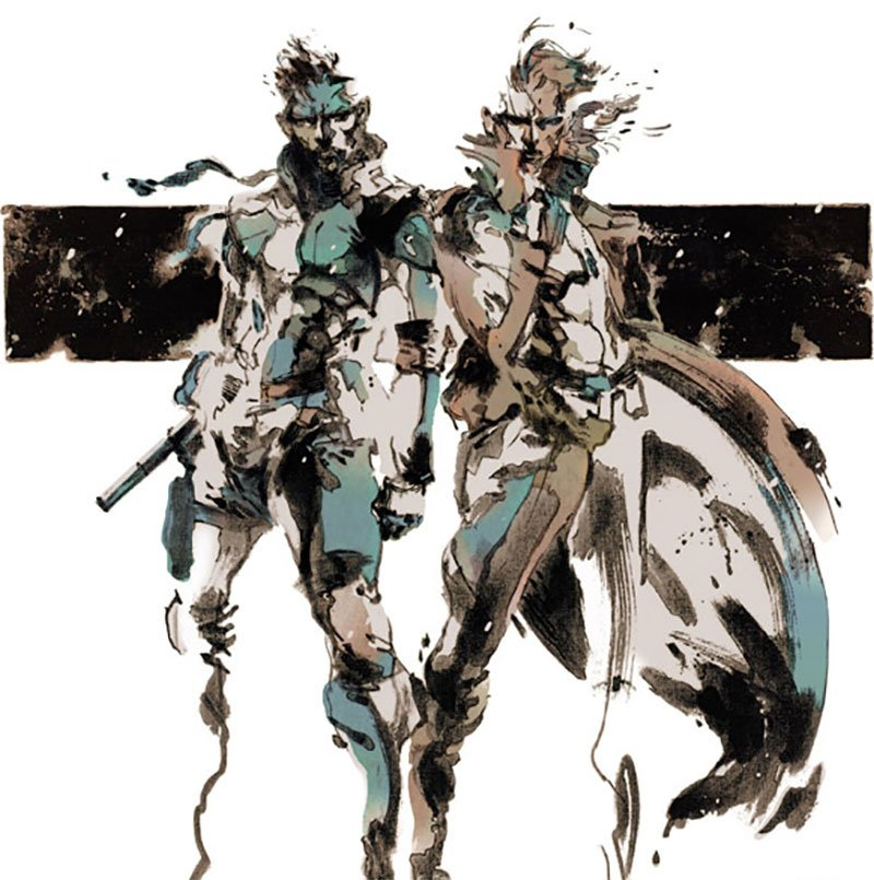
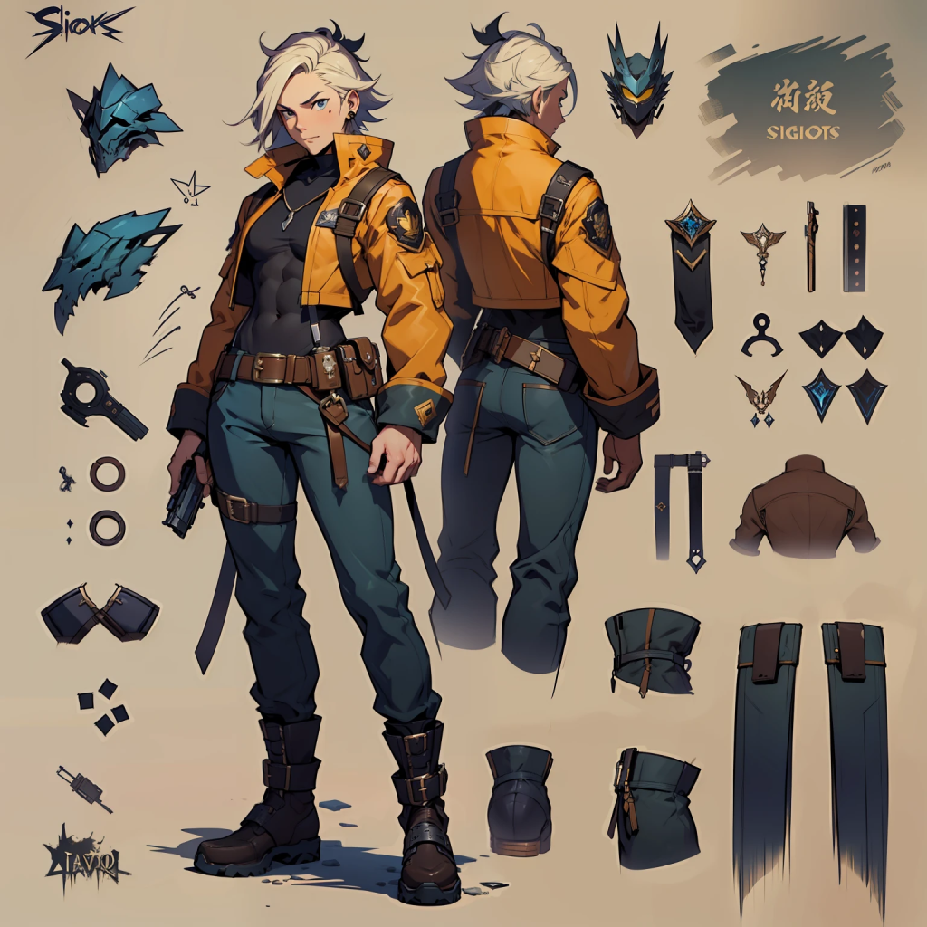
Art pieces like this are often misinterpreted as “concept art” by fans of video games.
These are often created right at the start of a project to allow the director to get a feel for the game (Trent Kaniuga, 2021). However, this would not be useful to a 3D modeller due to the lack of clarity in the character’s designs.
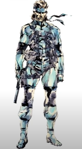
Yoji Shinkawa, the artist for both of these pieces, is one of the most beloved in the industry. Whilst this piece provides more clarity for 3D modellers and at the time was seen as an acceptable standard, by today’s standards this is still lacklustre (Trent Kaniuga, 2021).
To help aid 3D modellers, good concept art should show the character from multiple angles, whilst also breaking down smaller aspects of the design – such as clothes, weapons etc.
Detective – Quick Sketches (6th – 12th November):
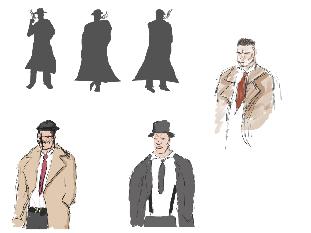
I started by creating a few different silhouettes to get a feel for the characters’ shape and personality. Silhouette thumbnails are a useful method of design when producing a large quantity of variations (Corriero, 2011). Whilst a detective has a fairly standard look, leading to a lack of wide variation, I still found this method useful to quickly generate ideas.
From those silhouettes, I quickly drew a few ideas, limiting myself to a few minutes per sketch. At this stage I wasn’t worried about colour schemes or small details, more so the style of clothes and facial features.
Detective – Finalising Idea (13th – 26th November):
Face:
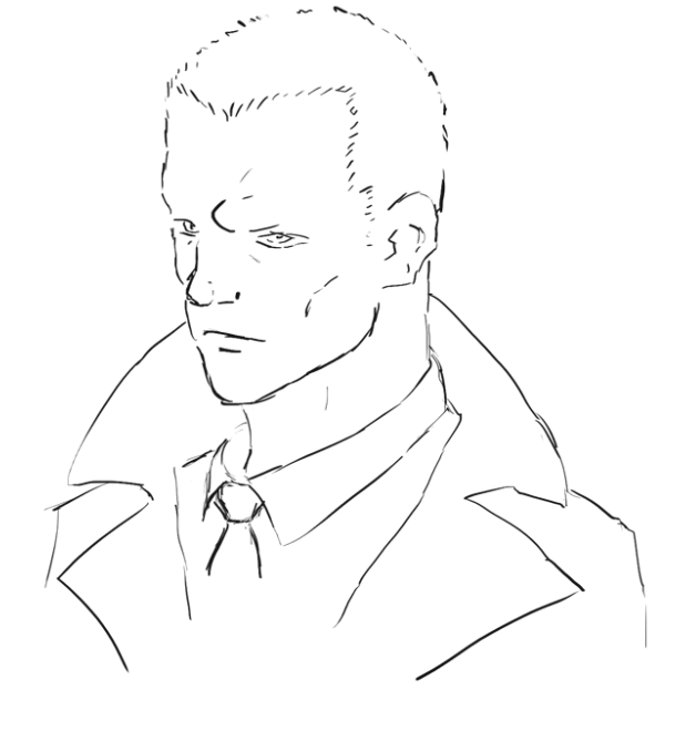
I decided to sketch the face first as it allowed me to focus on the detective’s personality and demeanour. My team described him as “cocky and moody” and so I was keen to express that through his facial expression before focusing on the design of the rest of his body.
Colour:
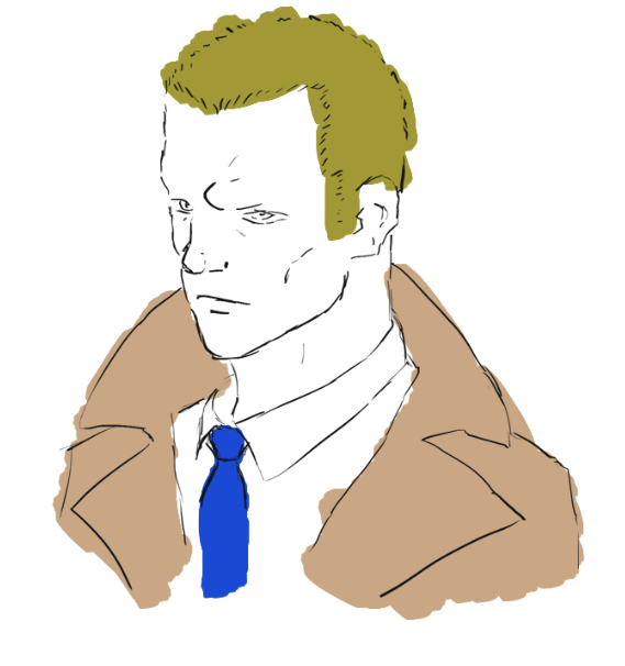
Now that a bust of the character had been created, I could test colour combinations.
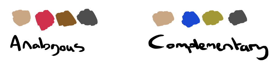
Colour harmony is described as colours that act together to be pleasing on the eye whilst creating visual interest (Color Matters, 2024). There are many methods to achieve this, however two of the most prominent are analogous and complementary colours.
An analogous colour scheme includes colours that are next to each other on the colour wheel, whilst a complementary colour scheme is comprised of colours that are directly opposite each other.
Through my prior research, I found that detective trench coats are usually a beige colour, and so I began each colour scheme with this colour.
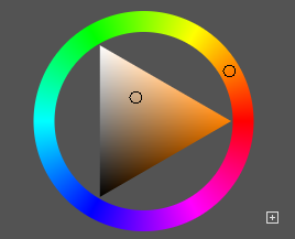
Directly next to this colour was either red or yellow, so I picked the remaining colours from these two areas.
As for the complementary colour scheme, directly opposite orange is blue and so I began picking colours from the blue and orange/yellow sections.
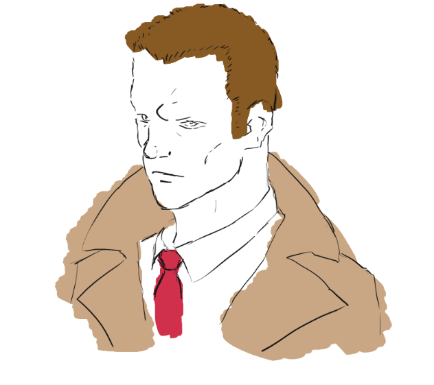
After quickly testing out both on the detective bust, I decided that the analogous colour scheme worked better for this character as the red tie seemed to really pop next to the other colours.
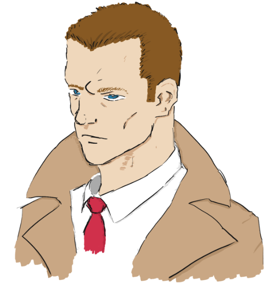
Once the colour scheme had been chosen, I created a much more detailed version to use as a reference for creating the entire body of the character.
Final Concept Art:
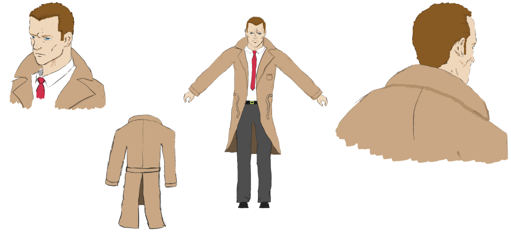
As soon as the bust and colour scheme had been finalised, I got to work on creating multiple angles of the character. Although I will be the person 3D modelling this character, it was important to still follow the best character design practices to aid in my modelling. For example, since the behind shot of the character does not show the entire body, I made sure to separately draw how the trench coat looks from behind.
Sheriff – Quick Sketches (27th November – 3rd December):
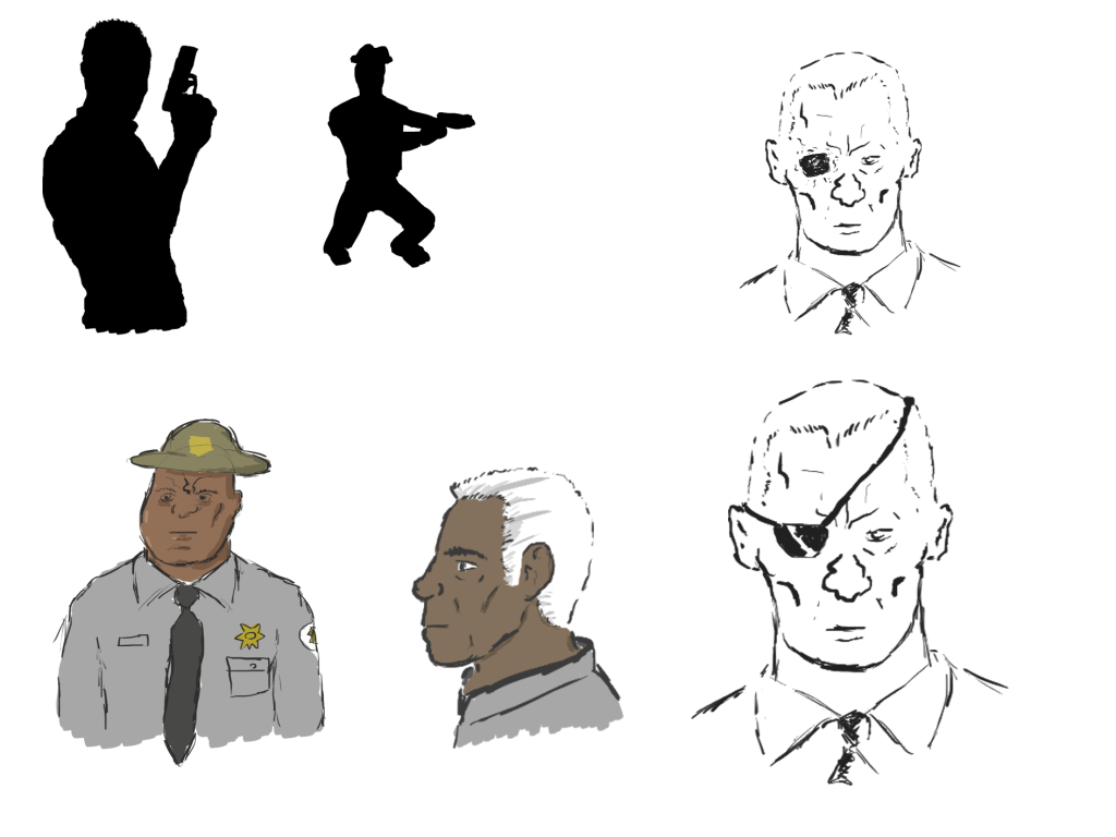
Like the detective, I started by drawing a couple of quick thumbnail silhouettes to get a few ideas flowing. The story of the sheriff is that he eventually turned into a monster after exploring the factory and so, I wanted to give him an iconic clothing item or feature that would still be recognisable to the player when they see him in his monstrous form.
I tried a few ideas, such as a sheriff hat, an eyepatch and slicked back silver hair. The eyepatch felt too much like Solid Snake and the silver hair may not be recognisable to the player when he is as monster. Therefore, I decided on the sheriff hat being his iconic feature.
Sheriff – Finalising Idea (4th – 17th December):
Face:
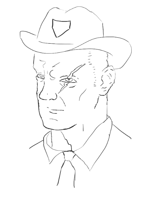
I decided to combine the idea of a damaged eye with the sheriff hat for the final design to add more character to him. However, as we are making a game with PS1 graphics, I am not sure if a scar across the eye would be visible due to the lack of detail available for PS1 textures.
Colour:
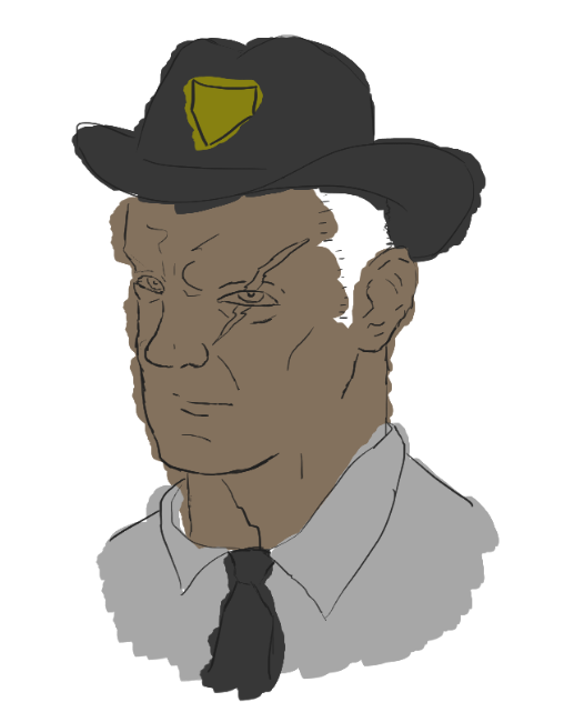
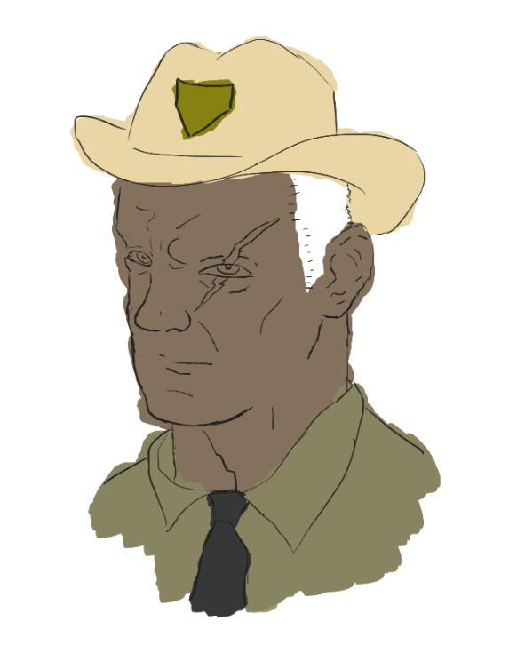
Both of these colour schemes are analogous and mimic similar colours to what sheriffs wear in real life. However, since the story of the character is quite dark and sinister, I opted to choose the colour scheme on the left. The darker tone may imply to the player that the character’s fate isn’t too pretty.
This technique is used frequently in shows and movies – perhaps most prominently in Breaking Bad when Walter White’s clothing becomes much darker in later seasons, coinciding with his character and personality doing the same (Watkins, 2012).
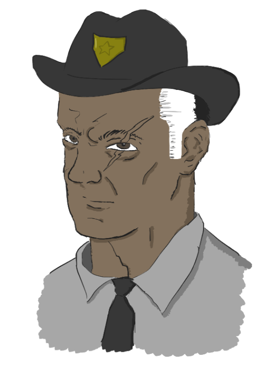
After the colour scheme had been chosen, I created a detailed version of the character’s head.
Final Concept Art:
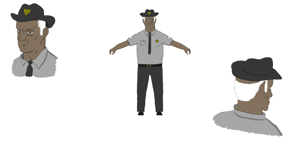
Similarly to the detective, I created concept art of the character from multiple angles to aid in my future 3D modelling. I decided to make him more obese than the detective character to further distinguish between the two characters when they are low poly 3D models.
Conclusion:
Overall, whilst creating two characters took longer than I had anticipated, I am happy with the results. The two pieces of concept art will aid in my 3D modelling as they show various angles of the characters.
If I could change anything about my concept art method, it would be to increase the communication and feedback from my team. Perhaps for the monster concept art I will ask my team for their thoughts at various stages of the design process, which may lead to a better final product.
References:
- Color Matters (2024) Basic Color Theory [Blog post]. Color Matters. Available online: https://www.colormatters.com/color-and-design/basic-color-theory [Accessed 29/03/2024].
- Corriero (2011) The use of Silhouettes in Concept Design [Blog post] Character and Creature Design Notes. Available online: https://characterdesignnotes.blogspot.com/2011/03/use-of-silhouettes-in-concept-design.html#:~:text=Silhouette%20thumbnails%20are%20among%20the,a%20short%20period%20of%20time [Accessed 29/03/2024].
- Dealessandri, M. (2021) A brief guide to becoming a concept artist. GamesIndustry.biz, Internet edition. 13 July. Available online: https://www.gamesindustry.biz/a-brief-guide-to-becoming-a-concept-artist#:~:text=The%20most%20important%20part%20of,’re%20doing%20your%20job.%22 [Accessed 27/03/2024].
- Ortiz, A. (2023) A couple of people standing next to each other with different outfits [Concept art]. Available online: https://www.seaart.ai/explore/detail/cj1jvdh4msbam1tsa240 [Accessed 28/03/2024].
- Trent Kaniuga (2021) Concept artist reacts to Metal Gear Solid Series Character Design- Analysis [Video]. Available online: https://www.youtube.com/watch?v=xWTDKb-j2Zo [Accessed 27/03/2024].
- Watkins, G. (2012) Breaking Bad’s Season Five Costume Designer on Walt’s Darker Look. Vulture, Internet edition. 8 August. Available online: https://www.vulture.com/2012/08/breaking-bad-costumer-interview.html [Accessed 29/03/2024].