Research (22nd – 28th January):
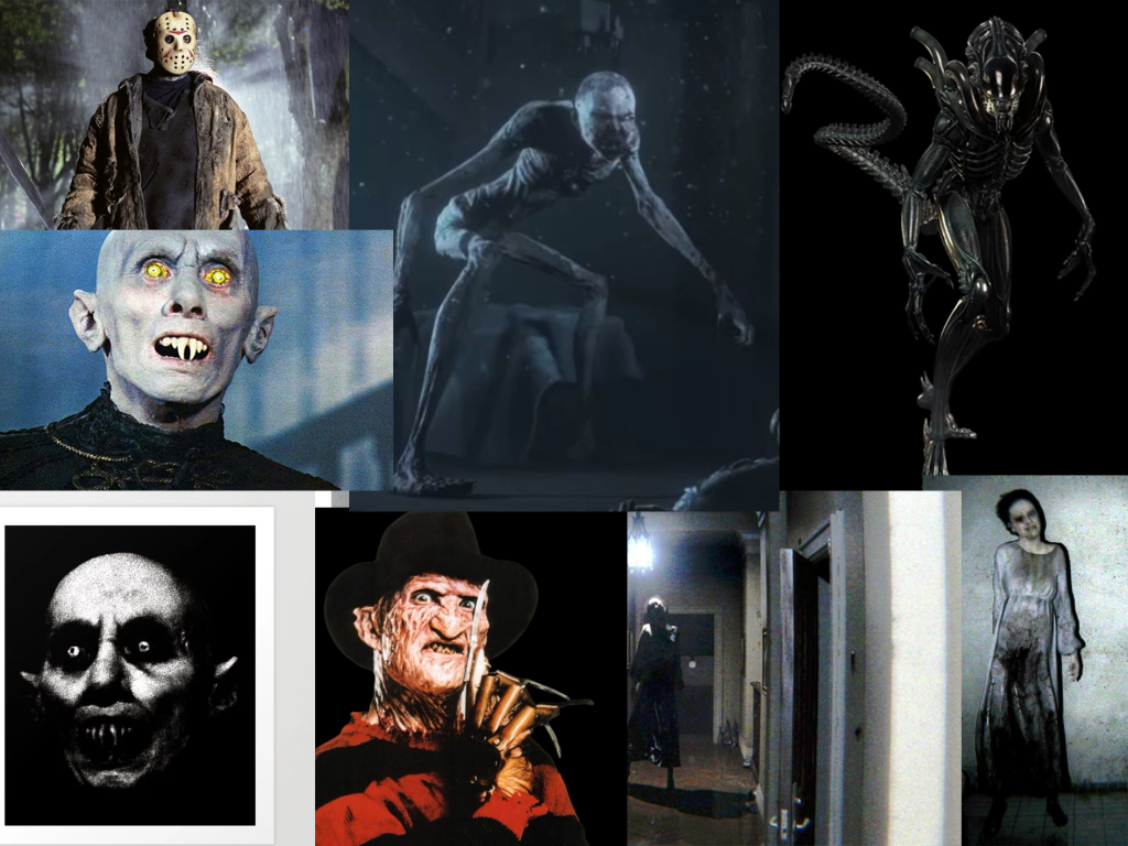
Before sketching some initial ideas, I decided to research famous villains/monsters and decipher what makes them iconic.
Every monster I researched had not only an iconic feature, e.g. Freddy’s claws and Lisa’s night gown, but also an iconic stance – leading to a memorable and recognisable silhouette. Silhouettes are vital to consider when designing characters, as they need to be perceivable from even the most rudimentary glance (Chandler, 2017). It could be argued that this is more important for horror characters, as the games are usually dark – leading to less of the character being seen.
Therefore, whilst creating quick thumbnail sketches, my main concern will be creating an identifiable silhouette, rather than focusing on small details.
Thumbnail Sketches (22nd – 28th January):
Initial Sketches:
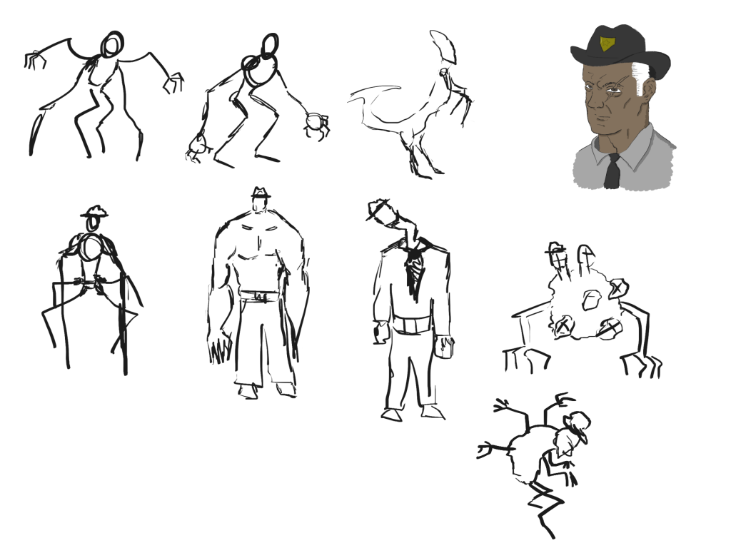
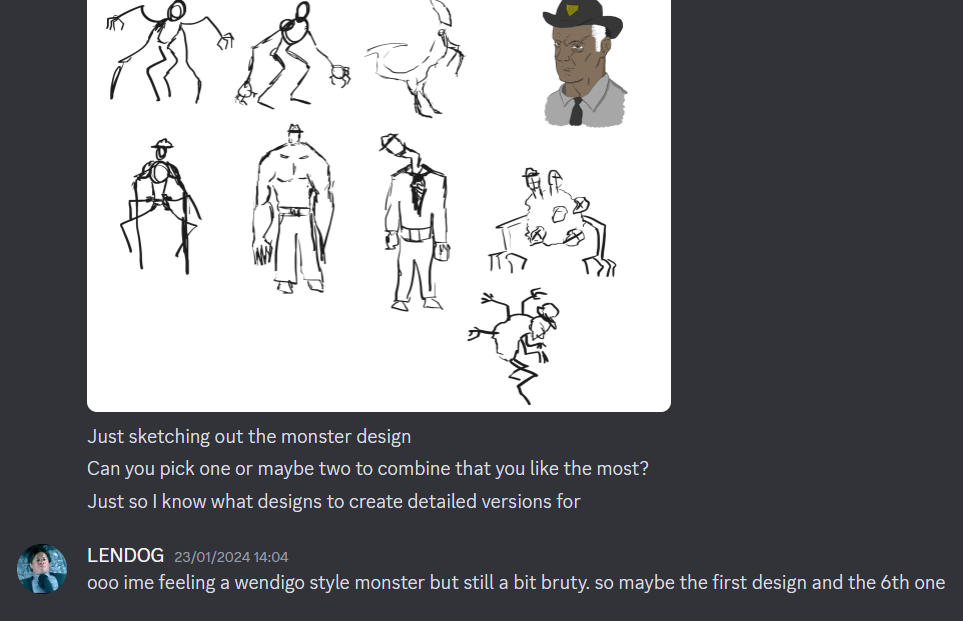
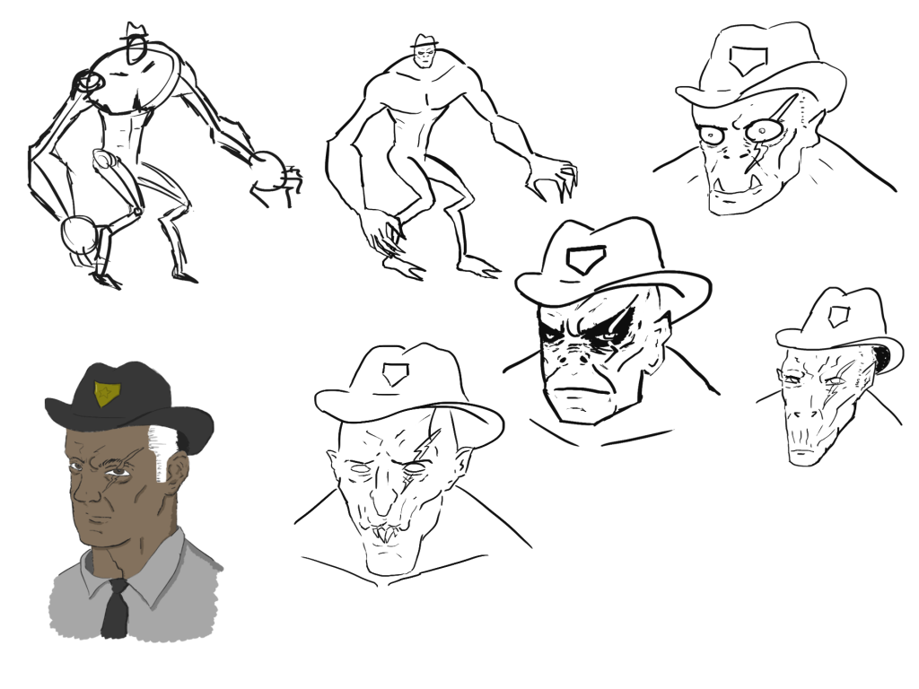
I created some rough thumbnail sketches, with the plan of getting feedback from my teammates. I tried to keep them as varied as possible so that they has a wide variety of choice when choosing their favourites. The sheriff is in the top right to remind myself and my team that he eventually turns into this monster, and so the design should incorporate some of his character’s elements.
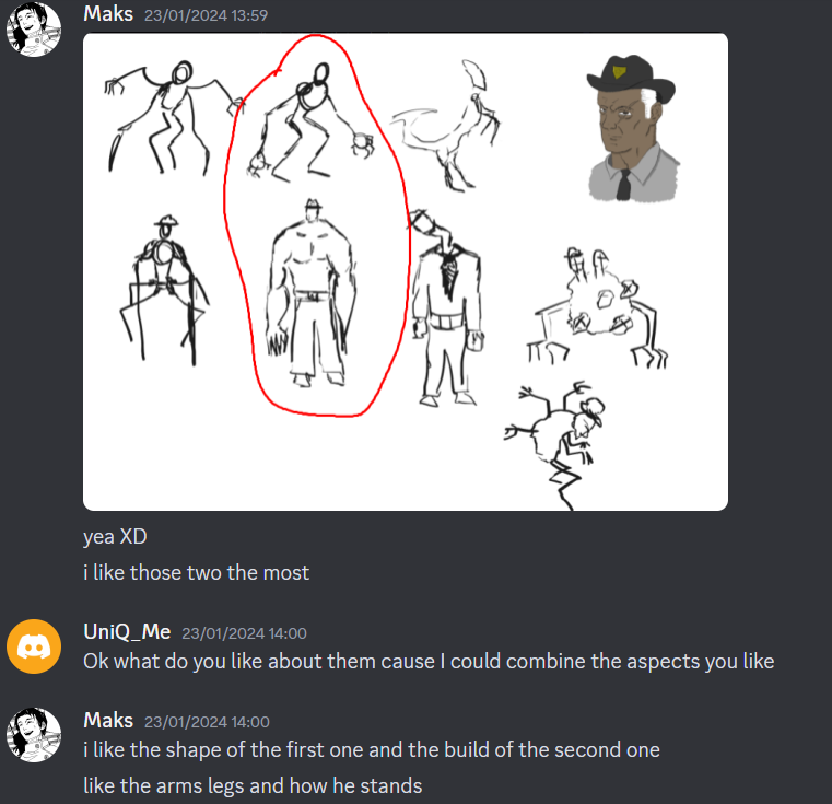
Both Maks and Lennox favoured the wendigo and brute designs and thought they might work when combined.
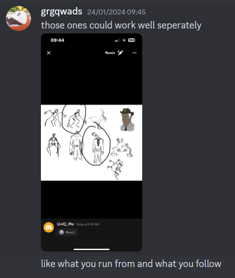
Tom also liked the wendigo design but opted for the snapped neck design for his second choice.
Combining Designs:
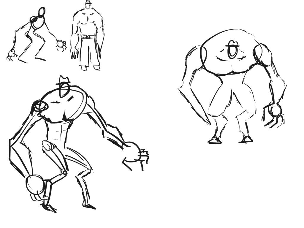
The first combination I tried was the wendigo and the brute, as that seemed to be the most popular choice amongst the team. I created two variations, one that was slimmer and sided towards having more wendigo attributes and another that had more brute-like attributes.
Lennox also mentioned that he liked the first design, and so I combined that with the brute to create a couple more sketches.
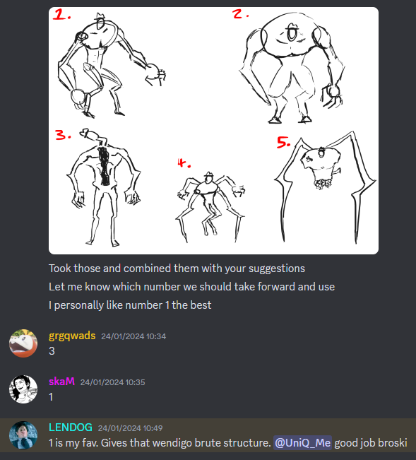
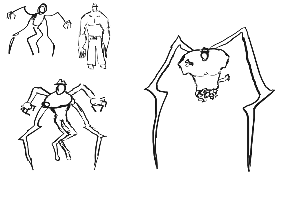
I also created a more detailed version of Tom’s favourite to add further choice to the final designs. Once I had five sketches, I numbered them and sent them to my team to vote on. The first design was the winner by a large margin and so that is the sketch that my more detailed designs will be based on.
Overall, I enjoyed incorporating my team’s ideas into the design process and it led to me innovating and combining ideas. If I had just designed the monster by myself, I would have found one favourite design and stuck to it, whereas this process forced me to create multiple sketches that weren’t particularly to my liking – which gave more variety.
One negative of the process could be that once a team member found a favourite design, they didn’t deviate from that when I created more detailed designs of what they favoured. Whilst everyone did vote for their previous favourite, combining the designs gave them more choice and offered an option for them to change their minds.
Finalising Idea (29th January – 11th February):
Face:
Now that I knew the body shape of the monster, I could design a face that would fit with it. For the four designs that I created, I tried to make each one different in some way via head shape and features.
Each design, however, did include the Sheriff’s hat and scar as a way of letting the player know they are the same character.
Unlike the previous stages of the design process so far, I held back on letting my team decide on their favourite. As the designer, I wanted to have the most control at this crucial stage and so I believed that I should be the one to decide on the face.
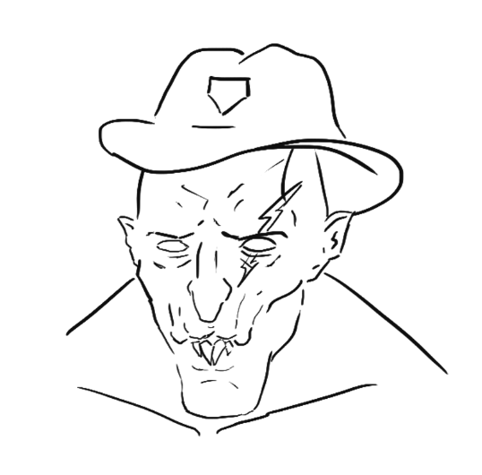
Ultimately, I chose this design for the monster as he seemed the most grotesque and deformed.
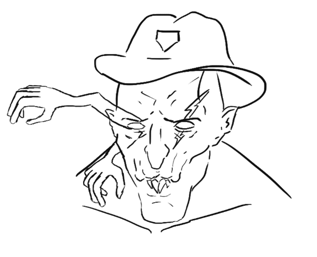
However, during the design phase, I forgot one crucial element of the character. The ELD stands for Eye Limb Disease and naturally the main monster of the game should be heavily effected by this disease.
Perhaps before designing the monster I should have created an ELD stages guide that shows the different effects during each stage of infection. We did discuss the various effects as a group, but having a visual to refer to would have been useful.
Nevertheless, I imagined the worst and final stage of the ELD being limbs growing out of the hosts eyes and so added those to the monster’s design.
Colour:
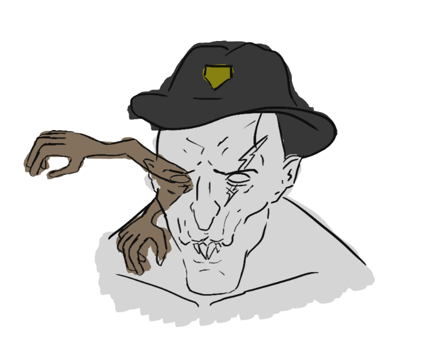
The monster’s colour scheme was much easier to think of than previous characters. I wanted his colour scheme to mirror the Sheriff’s and so I colour picked from his design and slightly tweaked certain elements, such as making the grey for the skin slightly lighter.
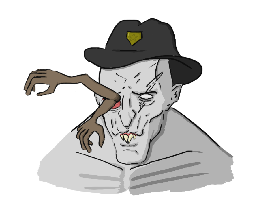
After deciding on a colour scheme, I created a much more detailed bust of the monster.
Final Concept Art:
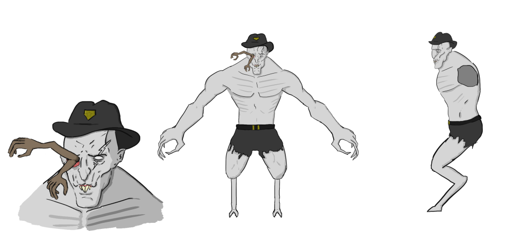
Like previous designs, after completing the bust I created multiple different angles to aid my 3D modelling of the character. The side view is missing the arms, as I noticed when researching concept art that this is a common practice due to their obstructive nature.
Conclusion:
Overall, this design process was more successful than the detective’s and sheriff’s. Discussing various designs throughout the process with my team led to much more innovation and ultimately a better design.
References:
Chandler, B. (2017) A Look at Graphics: Character Design in Silhouette. Adventure Gamers, Internet edition. 26 June. Available online: https://adventuregamers.com/articles/view/a-look-at-graphics-character-design-in-silhouette [Accessed 10/04/2024].